Related Entries
Processing e-mail attachments properly
The Cranky User
Building accessible tables
Inaccessible accessibility
Day 10 gets me stumped!
« Newsforge: What is the big deal about .Net?
» Javascript clock
Login page annoyances
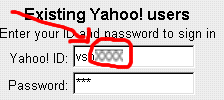
 It is useful to automatically set focus to form fields - saves the visitor one click. However, it can really go sore if your page doesn’t load quickly. The login page of Yahoo! mail suffers from this focussing happening too slow over a T1 line. Usually, the page loads, I go and add in my user name and while I’m halfway entering my password, the focusing kicks in without me noticing it. Effect is that half of my password is in the user name field - when working from office or cyber cafe, others can see it too.
 Webtrends Live has a login page that suffers from a tab order issue. It is username - Go button - password instead of username - password - Go button. I wrote to them, but they claim it must be browser bugs. I use Opera and Mozilla, on Windows on Linux. I suppose it must work with IE. The source code of the page seems to indicate that the tab order is set correctly.
usability