Calendar Heatmaps from Dataframes
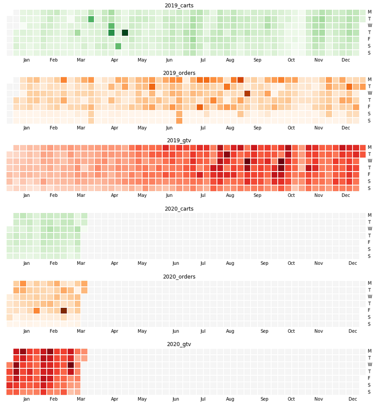
Github contrib map is such a great visualization to see the activity over a year. There are several javascript versions of this that provide interactive visualizations on the data; but when you don’t need interactivity and want to just visualize multiple data points over same time axis to see any trends, Calmap is a super simple library that can generate those.
Continue to see what we can make with our own data!
Update May 28, 2020 - code using this is added to my covid 19 tracker repo with actual output
How?
Let us say our data is in a csv file that has 3 columns viz., dt, cat and y which respectively indicate date, category and the actual value. For now, assume date is in yymmdd format.
I made this in an sqlite database and queried into a file. Hence no header row; and the default field separator is a pipe symbol.
Sample Data
190518|carts|1223
190411|carts|1447
191111|orders|204
190524|carts|1181
181111|gtv|332
...- cart = how many shopping carts were opened up
- orders = how many actual orders were placed
- gtv = what was the order amount
All grouped up by dates.
Code
I am assuming that you’ve a python3 environment with pandas, numpy, matplotlib etc and calmap installed.
import numpy as np
import pandas as pd
import calmap
from matplotlib import pyplot as plt
def parser(x):
"""
parse yymmdd into DateTime. Used in read_csv
"""
return pd.datetime.(, '%y%m%d')
# pipe sep, no header row, custom date parser, trim column values
df = pd.('databydate.csv', \
sep="|" ,header=None, \
parse_dates=[0], squeeze=True, \
date_parser=)
# since there isn't a header, let us name the columns thus. _ds_ and _y_ are conventions followed by
# facebook's nice prophet library - so using it here as well
df.columns = ['ds', 'cat', 'y']
# let us set ds as datetime index
["ds"] = pd.(., format="%y%m%d")
df = df.("ds")
## -- now comes the main part of making visualizations
ax= {}; fig = {} #each plot is a different figure - keep those and axes separately
# if you have more kinds of data, get more colormaps from
# https://matplotlib.org/3.1.0/tutorials/colors/colormaps.html
cmaps = """Greens Oranges Reds""".()
# I want to print 2019 and 2020 data only and for 3 categories one below the other
# to see how this year is trending compared to last.
for i, yr in enumerate((2019, 2020)):
for j,cat in enumerate("carts orders gtv".()):
#we take the events as a series; and fill dates for which
#there is no data available with 0
events =[. ==].y.("D").().(0)
# make the plot and set title
k = "{0}_{1}".(,)
[],[] = plt.(1, 1, figsize = (18, 2)) #tweak figsize x,y
calmap.(, year=, cmap=[],
daylabels='MTWTFSS',linewidth=1, ax=[])
[].()
#up to here is enough to plot in Jupyter notebook
#I wanted to save the plot as pngs too so that those can be
#embedded in an html page/email -- the next line saves those
plt.("/tmp/{0}_{1}_{2}.png".(,,))Done! Works very well for comparative visualizations.
Note - Calmap documentation has examples on how to make random timeseries data.