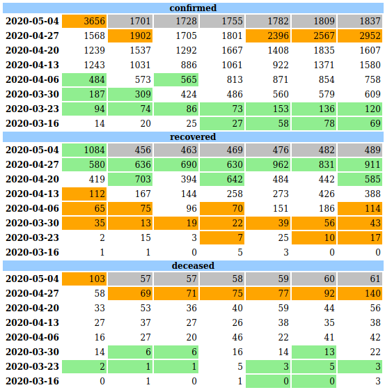
Many metrics are easier to visualize as a weekly table. Add anomaly highlights to that as well!
Update May 28, 2020 - code using this is added to my covid 19 tracker repo with actual output
I find looking at daily numbers folded by week (ie. Mon to Sun in one row) for last 8
weeks a good way to look at the data. Especially if multiple tables are put one below
the other for the same period, it is easy to identify patterns. Sample tables in a typical
e-Commerce system could be orders, shipments, payment_failures etc.
Instead of looking at this manually, why not use ML to automatically highlight anomalies? I tried
various things with hand coded models first, then ARIMA and finally settled on FBProphet library.
Read below to see how a simple system can be built with publicly available data. Bonus - if you have
not used jq and xsv, you can see how cool those are too.


